
Non-Profit Animal Shelter
Consulting
Website Audit
Page Redesign
A non-profit Animal Shelter approached me to evaluate their existing website and improve their Social Media Ambassador page. This page is responsible for recruiting volunteers to help promote the shelter's animals online. The client needed an outside perspective to identify what wasn't working and a clear, actionable plan she and her team could realistically implement.
Note: Specific organizational details and some visuals have been omitted in accordance with a signed NDA.
The Problem
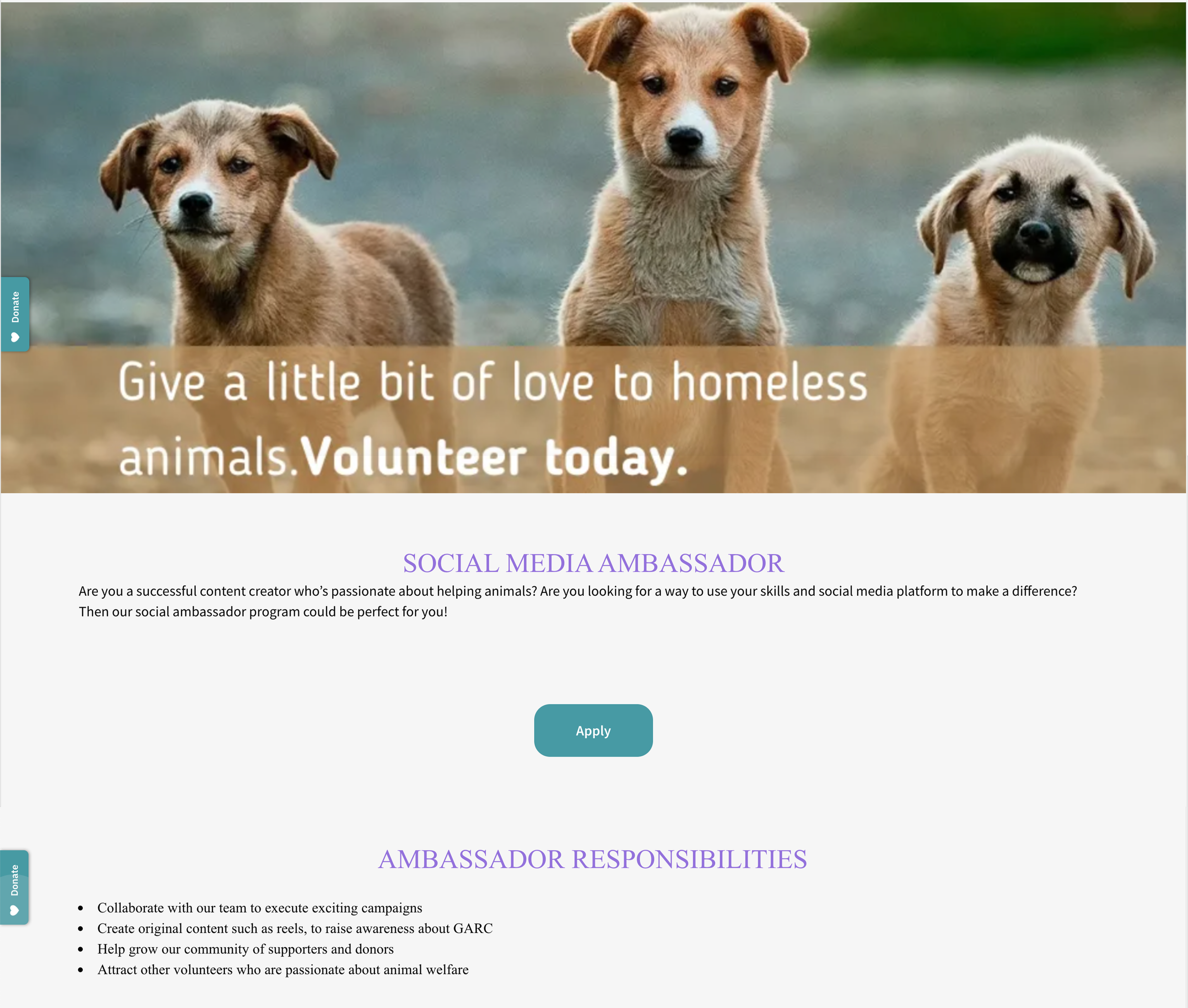
The Social Media Ambassador page needs to convert more visitors into volunteers. The broader website had accumulated inconsistencies over time. This was likely caused from multiple contributors maintaining it without shared guidelines, resulting in a page that felt unpolished and difficult to navigate.
My Process
1
Website Audit - Heuristic Evaluation
I began with a full heuristic evaluation of their website, systematically identifying usability issues. I documented each item that could be improved upon, noted its impact on the user experience, and outlined a specific recommendation for how to address it.
I also conducted a comparative review of other nonprofit organization websites to benchmark what effective shelter and volunteer recruitment pages typically look like, and to identify patterns worth bringing to the design.
2
Identifying Core Issues
My audit surfaced four recurring themes across the site: low accessibility, inconsistent branding, poor visual hierarchy, and overall design inconsistency — including mismatched fonts, colors, and element sizing that varied from page to page. These weren't just aesthetic problems. They were making it harder for visitors to understand what was being asked of them and where it came from as an organization.
3
Creating a Design Guide
Rather than simply flagging problems, I created a design guide as a long-term resource for the client and her volunteer team. It included a simplified, accessible color scheme to replace the overextended palette, a typography guide establishing consistent font choices and size hierarchy, and updated button styling to bring uniformity to interactive elements across the site. The goal was to give the team a reference they could actually use going forward and not just for this page, but for any future updates.
4
Redesigning the Ambassador Page
Applying the design guide to the Social Media Ambassador page, I restructured the page layout, simplified and condensed the content for readability. Then I rewrote and repositioned the call to action to make the volunteer sign-up path clear and prominent. The redesign was delivered as a model for the client to implement herself and given to her via her Wordpress account where the site was housed.
Client Outcome
The client was happy with the deliverables and implemented the majority of my recommendations. She made some additional changes of her own during implementation because of personal taste — my role was to give her the tools and direction to move forward confidently, not to own the final product.
The project resulted in two tangible deliverables: a comprehensive design guide her team can reference for future site maintenance, and a restructured, more accessible ambassador page designed to better convert visitors into volunteer ambassadors.
Reflection
This project reinforced how much impact a well-documented audit and a practical design guide can have for small nonprofits that rely on volunteers to maintain their digital presence.
The biggest challenge was scoping recommendations that were genuinely actionable for a small team with limited resources and limited working knowledge of how to work in Wordpress. This pushed me to prioritize ruthlessly and communicate the why behind every suggestion, not just the what.