
Acme Pie Co.
Responsive Website Design
Photo from Yelp User (Rachel S.)
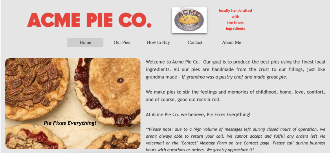
Acme Pie Company is a local Arlington (VA) pie shop owned by pastry Chef Sol Schott located on Columbia Pike. Previously selling wholesale pies out of a basement kitchen in a similar location, this shop opened its own storefront in 2019. It emphasizes handmade pies with local ingredients and sells through its dedicated storefront as well as several local eateries in the D.C. area.
Observation
The current website lacks responsiveness and needs a more polished, user-friendly design. There are several URLs that are not properly linked, and the product information is presented in a somewhat cluttered manner. The site appears to have been built primarily to provide basic information rather than to function as an engaging, user-friendly platform for new visitors. From reviewing various articles about the shop, it's clear that the owner has traditionally relied on word of mouth—especially through restaurant sales of his pies—rather than focusing on retail. This is reflected in the website's minimalist layout, which features only basic information and a few enticing pie photos but lacks the functionality and organization needed to attract and serve new customers effectively.
Goal
Create a responsive website design in order to ensure the website is fully responsive and is optimized for multi-device use.
Improve the organization and layout of product information by streamlining the presentation of product details.
Research
What are my objectives?
To thoroughly evaluate the current Acme Pie Co. website through Heuristic Evaluation and identify areas for improvement to better meet user needs and industry standards.
Understand users shopping habits for specialty desserts, focusing on their preferences and behaviors.
Methodologies
Font Selection is consistent but size and weights are not and will need to be unified throughout the website.
Several hyperlinks are listed but are not connected. Will need to actually connect them during the re-design.
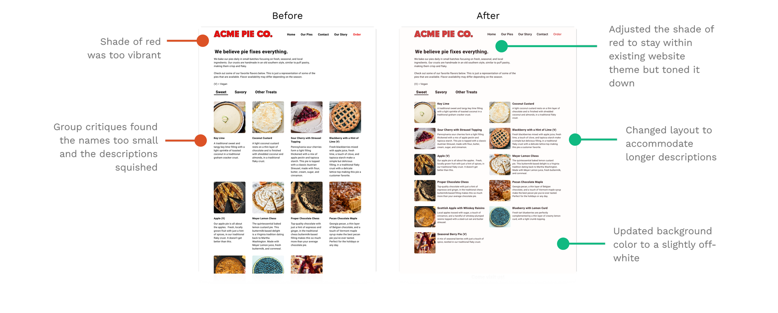
Color choices are accessible but the red is quite vibrant
Informational copy is excessive in certain sections and needs to be properly organized to a more appropriate section
Heuristic Evaluation Recap
Competitive Analysis
This analysis will help identify trends or standards established in the website category. By examining these websites, we can see how competitors organize content, structure their websites, and encourage customers to engage with them.
-
Strengths
Hero section is dynamic (video) is responsive; breakpoints work
Simple design that focuses on the product itself
Link to social media
Easy to follow navigation
Clean Layout of various pages
Weaknesses
Logo is of a monkey which doesn’t really align with what the shop sells; seems random
Some product images are missing and say “coming soon”
Spacing of heading and body text on “Our Story” page isn’t consistent with the rest of the site, looks too cramped
-
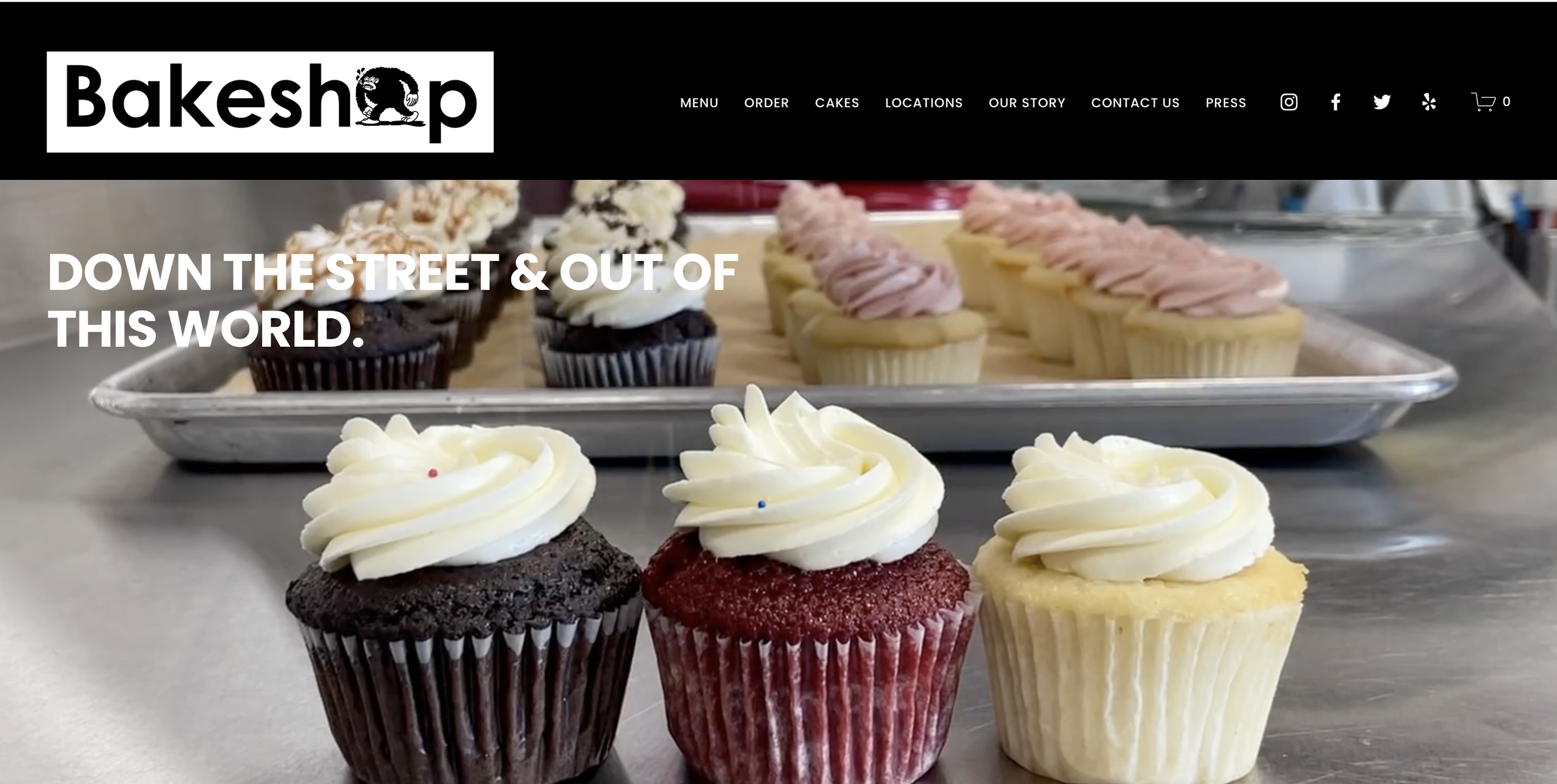
Strengths
Hero Section is clean and simple, showcasing a main product of the shop
Good use of colors for text and CTA buttons
Weaknesses
Not a clear text size hierarchy (from looking at it in Inspect)
Spacing between text doesn’t appear to be consistent throughout landing page
-
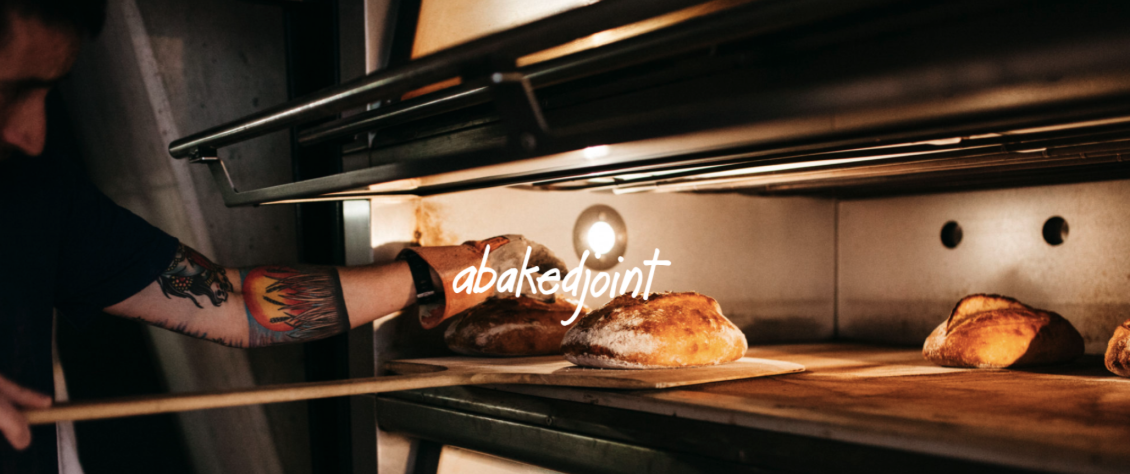
Strengths
Color scheme is reflective of in person experience
Easy to navigate website because it’s one page
Weaknesses
No navigational buttons
Information seems outdated in the Order section as it’s still for Mother’s day (as of the time of this analysis in June 2024)
Location of font change seems unnecessary in the location & hours section
Missing a lot of additional information that could attract customers or help them learn about establishment
Logo is too small with the level of detail it has
Qualitative Survey
This will help me gather feedback from a wide age range of potential customers and identify their shopping habits/preferences when referring to speciality desserts.
8
Interviews
27-75
Age Range
11
Questions
All participants have purchased specialty desserts online, either for home delivery or in-store pickup, indicating a strong preference for the convenience of online shopping.
Participants value detailed product descriptions, especially regarding ingredients, due to concerns about allergies or dietary restrictions.
Key Findings
While some participants would still visit the store if they could reserve products via phone, others expressed that the lack of online ordering would deter them, particularly if convenience or delivery was a priority.
Primary device used for online shopping was Mobile.
Define
POV Statements
The user finds it difficult to navigate the current pie shop website for important information about the pies. Since they don't use social media, they miss out on updates about seasonal flavors and promotions, which are primarily communicated through those channels.
How might we simplify the navigation on the website to streamline the process of finding important pie information?
How might we effectively communicate seasonal flavors and promotions to users who do not use social media?
Point of View #1
The user is frustrated by the lack of an online ordering/pickup system and feels that it takes up valuable time. While they appreciate the detailed descriptions of the pies on the website, they wish there was a photo gallery with product names to better visualize the quality of the products.
How might we create a streamlined online ordering system for users who are looking to save time?
How might we create a way for the user to view the product along with the description prior to visiting the store or purchasing the pie?
Point of View #2
Personas

Adriana | 32 years old | Consultant | Arlington, VA
Adriana is always on the go! Whether it’s for her work or social outing with her friends, her schedule tends to be packed. Despite the hustle and bustle, Adriana enjoys hosting gatherings and delights in discovering unique specialty desserts to share. She prefers the convenience of ordering ahead and picking up, ensuring that everything runs smoothly without sacrificing quality.
-
To quickly and easily order specialty desserts for gatherings with friends
To have a seamless online ordering experience with a clear and efficient pickup proces
To ensure the desserts are high-quality and well-presented
-
Online ordering with option to pick up in store
Detailed descriptions of product to make an informed decision
Product reviews to ensure a quality product
-
Highly proficient with technology, uses a smartphone, laptop, and tablet daily
Frequently uses apps for convenience, including food delivery and online shopping
-
Limited time to visit stores due to a busy work schedule
Frustration with websites that are difficult to navigate or lack online ordering options
Dislikes waiting in lines or dealing with crowded stores, especially during busy times

Betty | 70 years old | Retired | Falls Church, VA
Betty is a doting grandmother who loves supporting her local community! She loves to cook but isn’t much of a baker so when the need arises, she loves to visit her local shops to grab a treat. Betty prefers to buy her treats in store so she can explore the seasonal flavors or specials but wants to know ahead of time what she might expect.
-
Easily find information about regular flavors before visiting the store
Continue supporting local shops and enjoying the personal experience they offer
To feel informed and prepared for her in-store visits without unnecessary hassle
-
Easy to navigate website
Simple instructions for how to purchase in person
Lists of products with descriptions
-
Uses a smartphone and tablet primarily for communication and browsing
Comfortable with basic internet use but prefers straightforward, user-friendly websites
-
Finds it challenging to navigate websites with too many steps to find information
Dislikes not knowing what to expect before visiting a store
Prefers not to purchase online due to concerns about quality and wanting to see the quality of the product in person
Ideate
User Flow
I decided to do the user flow for the ordering system since that would be a new addition to the website. After reviewing several bakery websites, it seemed like the most business and user friendly methods were using the Toast system.
This flow looks to replicate the process to get to the Toast page and in an ideal situation, the shop would buy the system. This would allow the shop to update its stock in real time which would help users shopping online know what's in stock for ordering same day.
Low Fidelity Sketchs
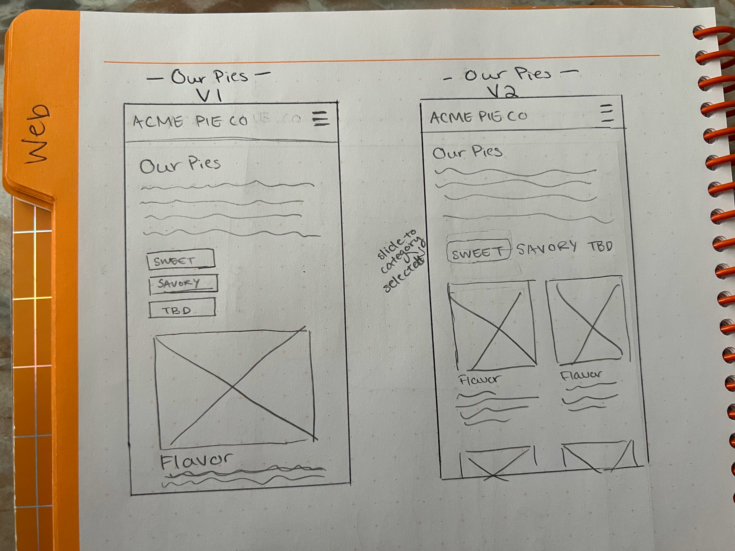
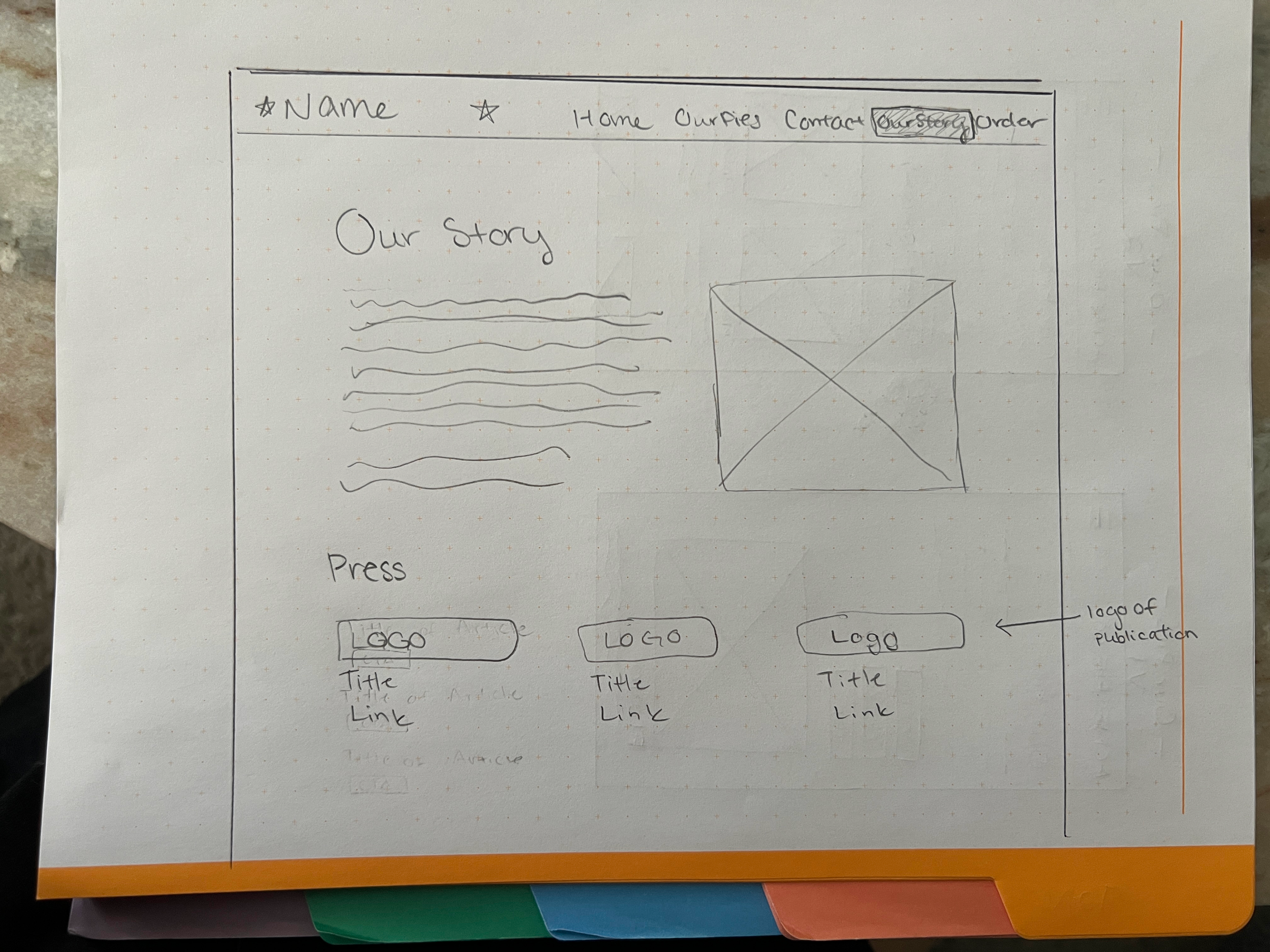
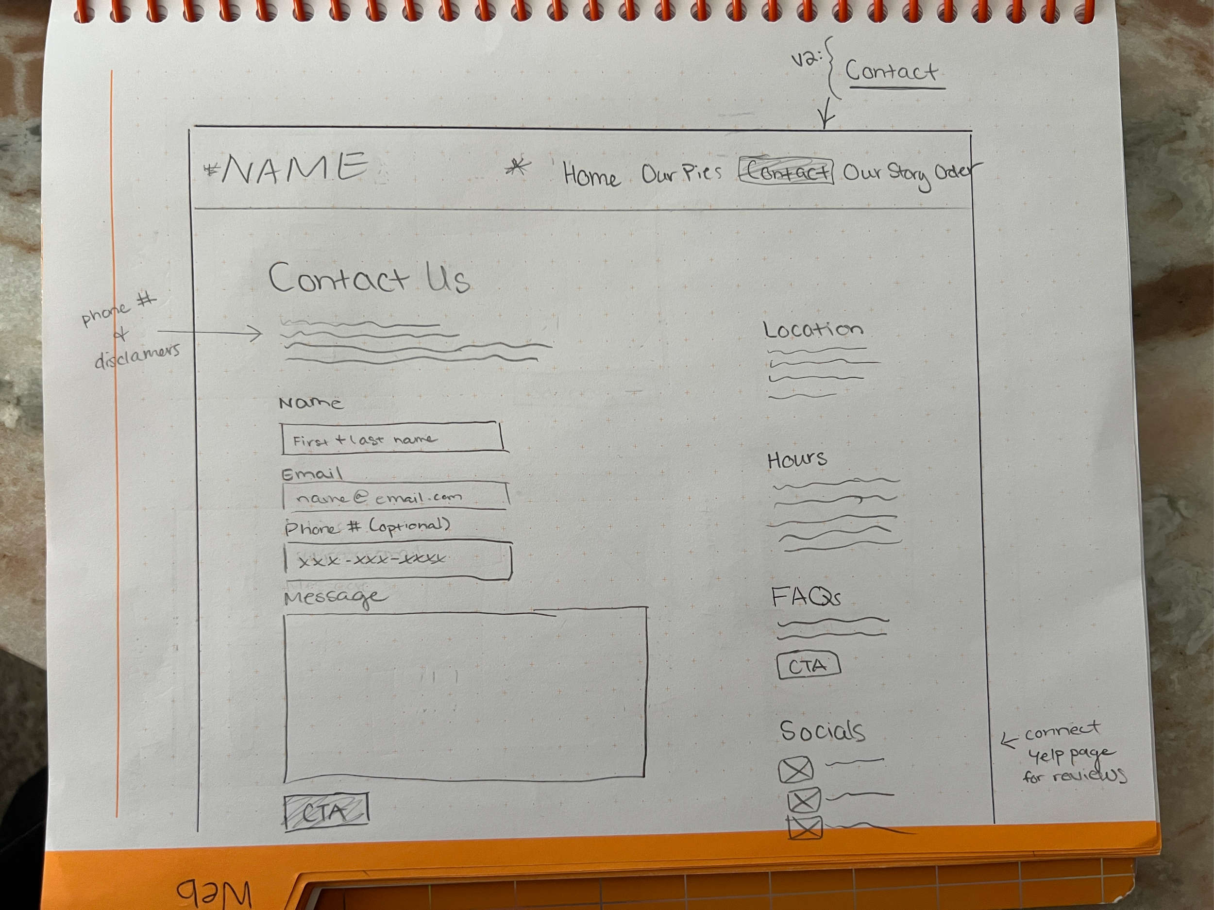
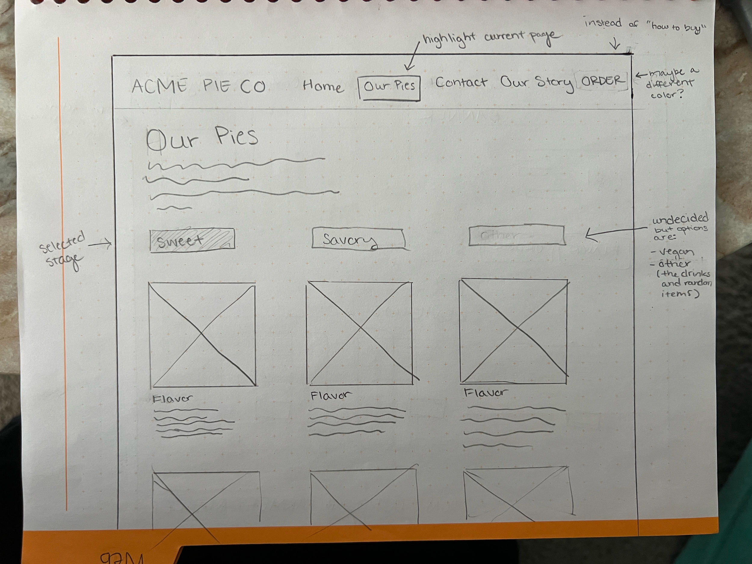
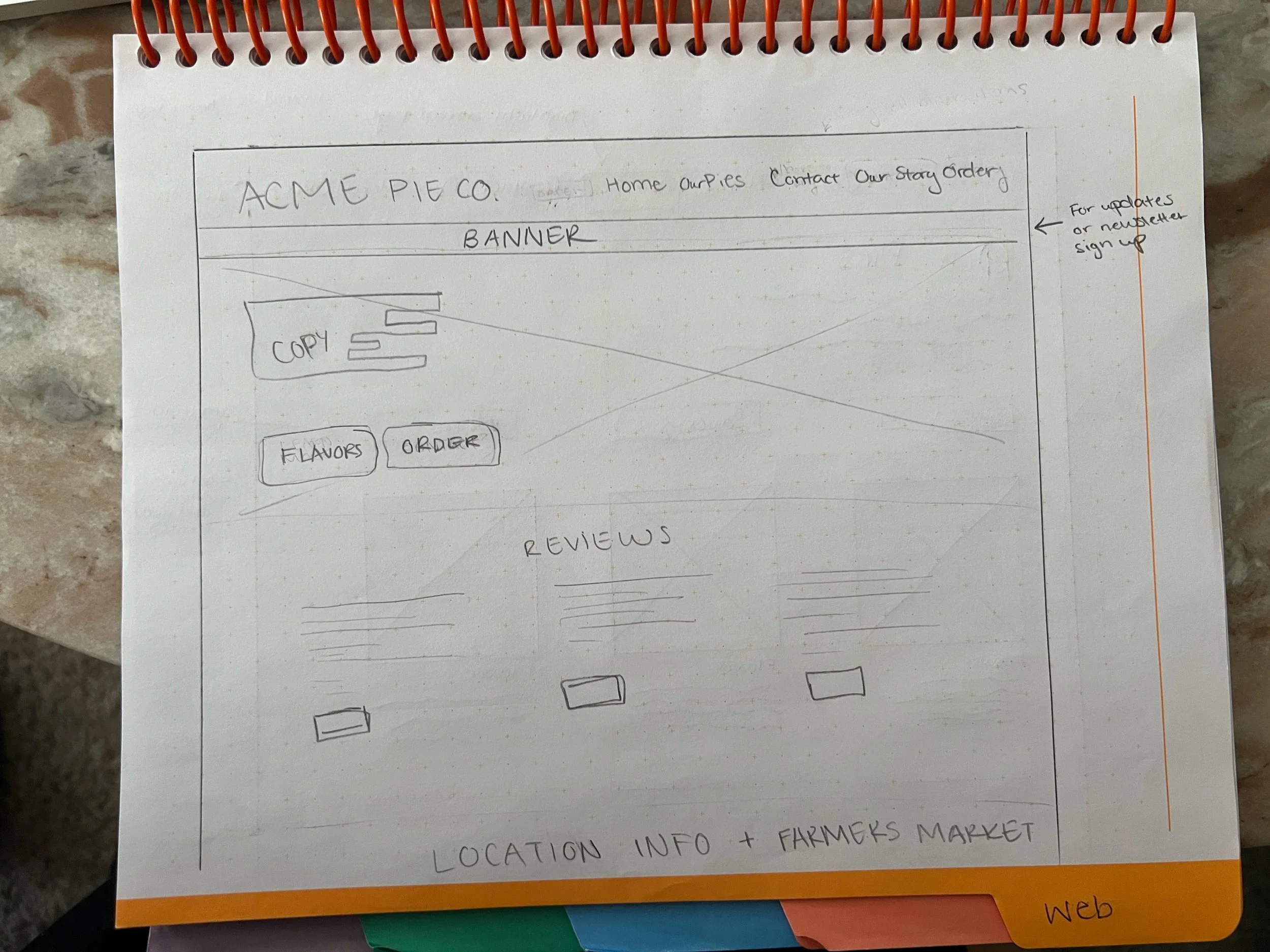
Design
Mid Fidelity
These wireframes were meant to build off of the feedback from the Low-Fi Sketches. Refining the sketches in a digital format to start painting the picture for users but not yet implementing the main color schemes or font styles. These frames were used for testing to establish a user friendly experience before reformatting for High Fidelity.
Testing
Test the usability of the website wireframes in mobile layout as well as desktop for key changes that were made from the last set of testing. This includes evaluating navigation, ease of finding information, and overall satisfaction with the design and functionality.
Objective
Testing Method: Moderated
Participants: 5 users
Tools: Figma Prototype
Desktop Updates
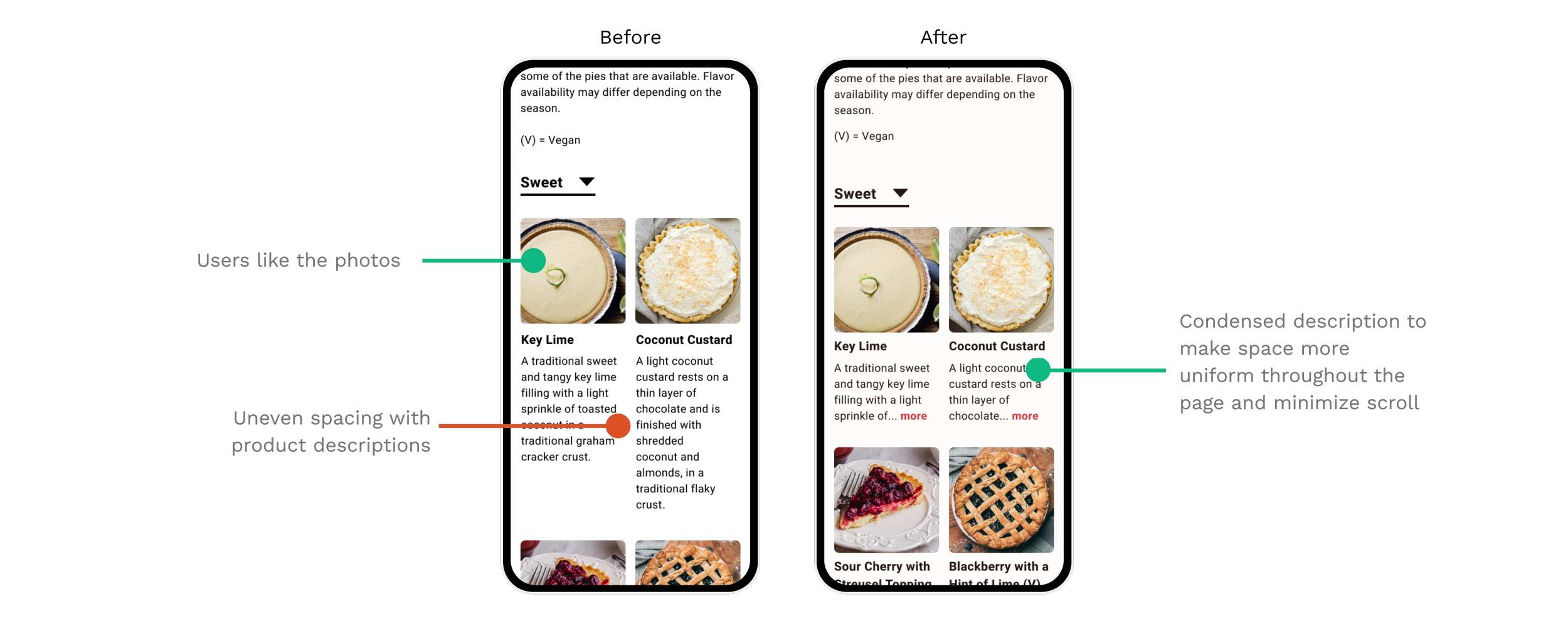
Mobile Updates
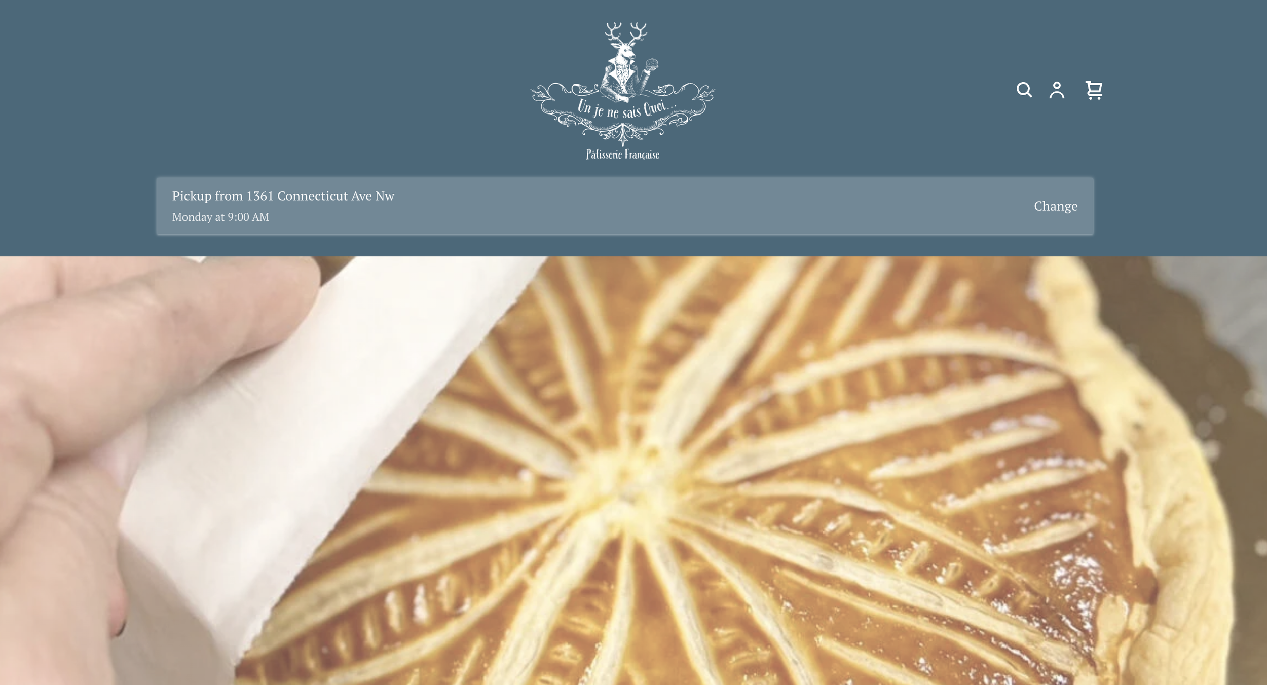
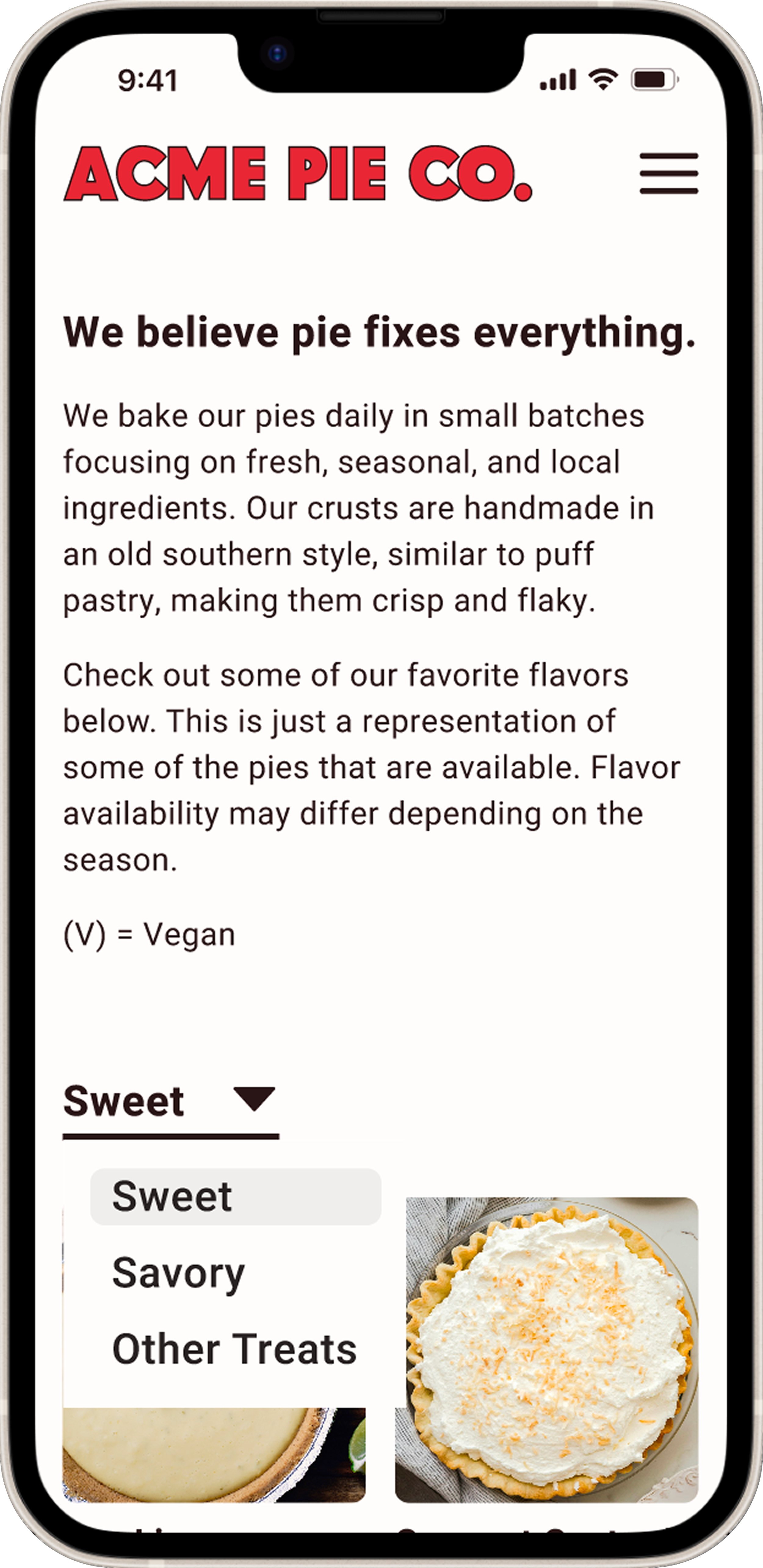
Final Prototypes
Desktop Prototype
Mobile Prototype
My Conclusion
For this project, we were encouraged to reach out to local businesses to help them with their websites but unfortunately, this particular business was unresponsive. In leu of direct information from the client, I gave myself parameters to work within. Having to put myself in the shoes of the owner and try to think like them, based off their current website, was really informative but also difficult. Imposing restrictions on myself and sticking to them made some items more challenging but aided me in growing my confidence as a designer.
My main takeaway from this project is that you cannot please everyone with every detail but you can still provide a product they will be happy with. I say that because no design is going to please 100% of people and at some point, I needed to trust my gut knowing that DesignLab had provided me with the skills to move forward with the best possible solution.