

Venmo Receipts
Adding a receipt capture tool to Venmo to improve expense splitting
Venmo users struggle with splitting itemized bills, leading to frustration and manual calculations. While Venmo simplifies expense sharing, it lacks a built-in feature for accurately dividing receipts. This project aimed to create a seamless way for users to snap a receipt, assign items, and request the correct amount—all within the app.
Users need a seamless way to split itemized receipts within Venmo without manual calculations.
Problem & Research
Splitting bills is frustrating
In order to understand why this is a frustrating task, I conducted competitor analysis, user interviews, and usability tests on mid-fidelity wireframes. While Venmo makes splitting expenses simple, itemized receipts are a different story. We have to resort to manual math, screenshots, and extra apps, leading to frustration and mistakes. My goal? Design a receipt capture feature that eliminates the hassle without compromising Venmo’s intuitive experience.
A Look at the Competition
Before designing, I analyzed competitors like Tab, Splitty, and Splyt to uncover what worked and what didn’t. This deep dive helped identify opportunities for Venmo’s receipt capture feature, ensuring it solved real user frustrations while staying competitive.
Quick Insights:
Camera receipt scanning was a must-have
More control over tax & tip calculations
Competitors lacked seamless integration (Venmo’s edge)
-
Strengths
Simple layout, easy to navigate
Can join bills/receipts with other users
Can connect to Venmo to send request
Ability to look at archived receipts
can edit items if they were not scanned correctly
Birthday Setting that allows the group to cover the total owed by another member
Weaknesses
Account creation doesn’t require a password which could result in privacy issues pertaining to receipts
Screens background is a transparent layer over whatever your camera sees which forces your camera to be active while using app even when you’re not actively taking a photo
Adding a receipt from saved photos is only available for iPhone, not Android
Only connects to Venmo, no other money sharing apps (eg. Cashapp, Zelle)
-
Strengths
Simple layout
Gives summary of the split once finished
Gives a quick tip or “did you know” fact on summary page
Can connect to Venmo, iMessage, and “Other” to send request
Ability to look at archived receipts
Can copy and paste charge with note to send via text if needed
Can make “groups” of people you split expenses with oftenItem description
Weaknesses
If you add a user/person to the bill, you have to unselect each item that isn’t theirs
automatically adds the tip even if it wasn’t displayed on the receipt, must manually delete it (if needed)
No “Home” page or selection page, default is camera
-
Strengths
Works with Venmo and Cashapp
Shows video instructions of how to properly upload receipt
Aesthetically pleasing interface
Can pre-split specific line items
Easy to send link for receipt to friends who don’t have the app
Weaknesses
Only 1 receipt can be added per month in the free version. Must pay monthly subscription to add more
User with App must have Venmo or CashApp account to move forward
Doesn’t apply receipt discounts for specific items, must edit yourself
Not extremely straightforward in terms of which steps to complete at all times
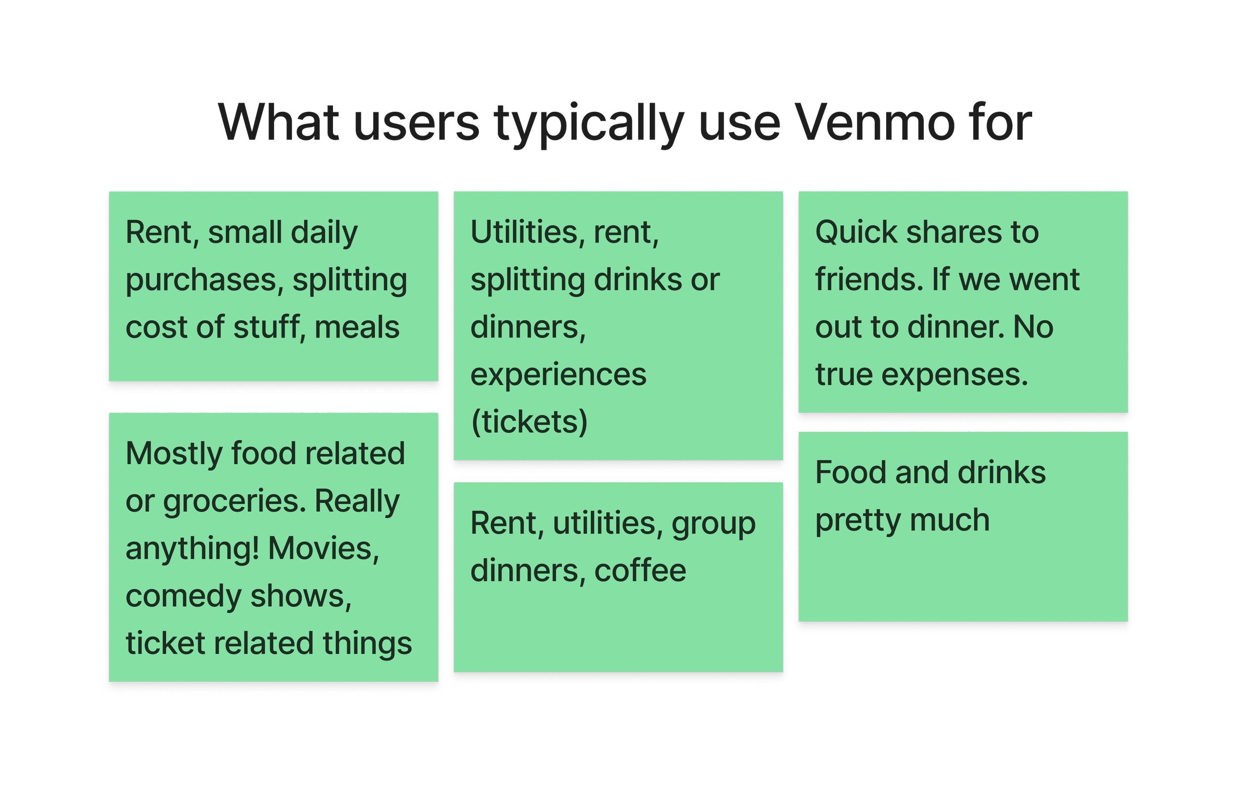
User Interviews
User interviews uncovered behaviors and challenges that shaped my design decisions.
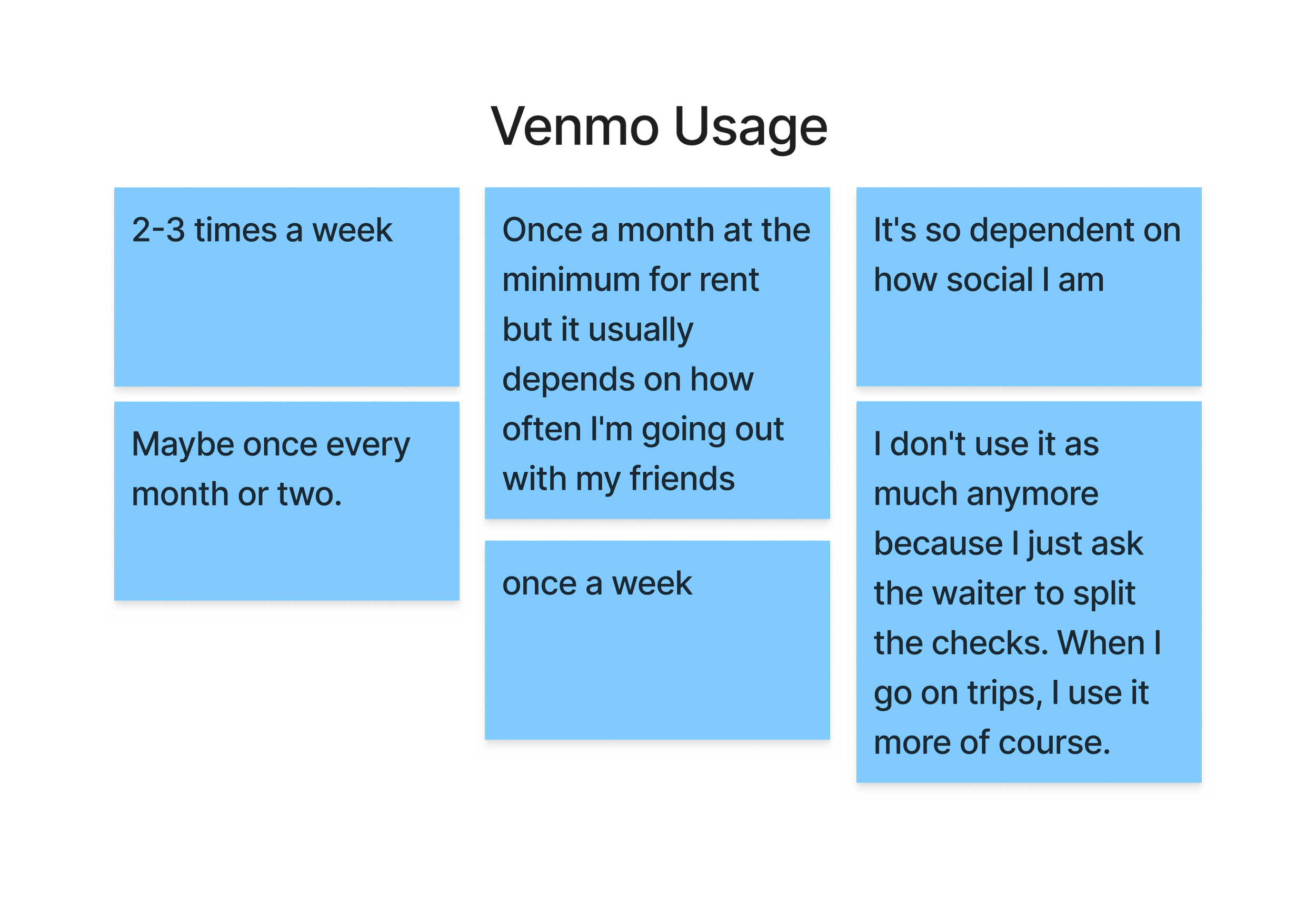
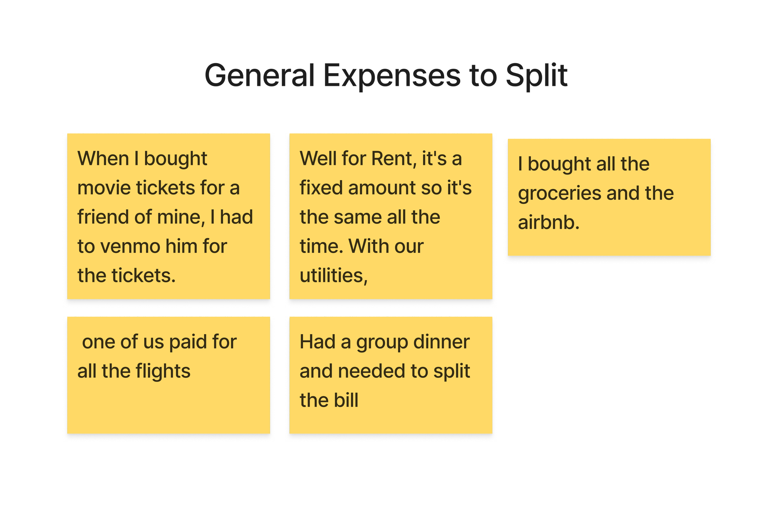
Usage Depends on Social Habits - Frequency of use varied— social users relied on it more often.
Overall Positive Experience - Users were generally happy with Venmo and found it convenient when needed.
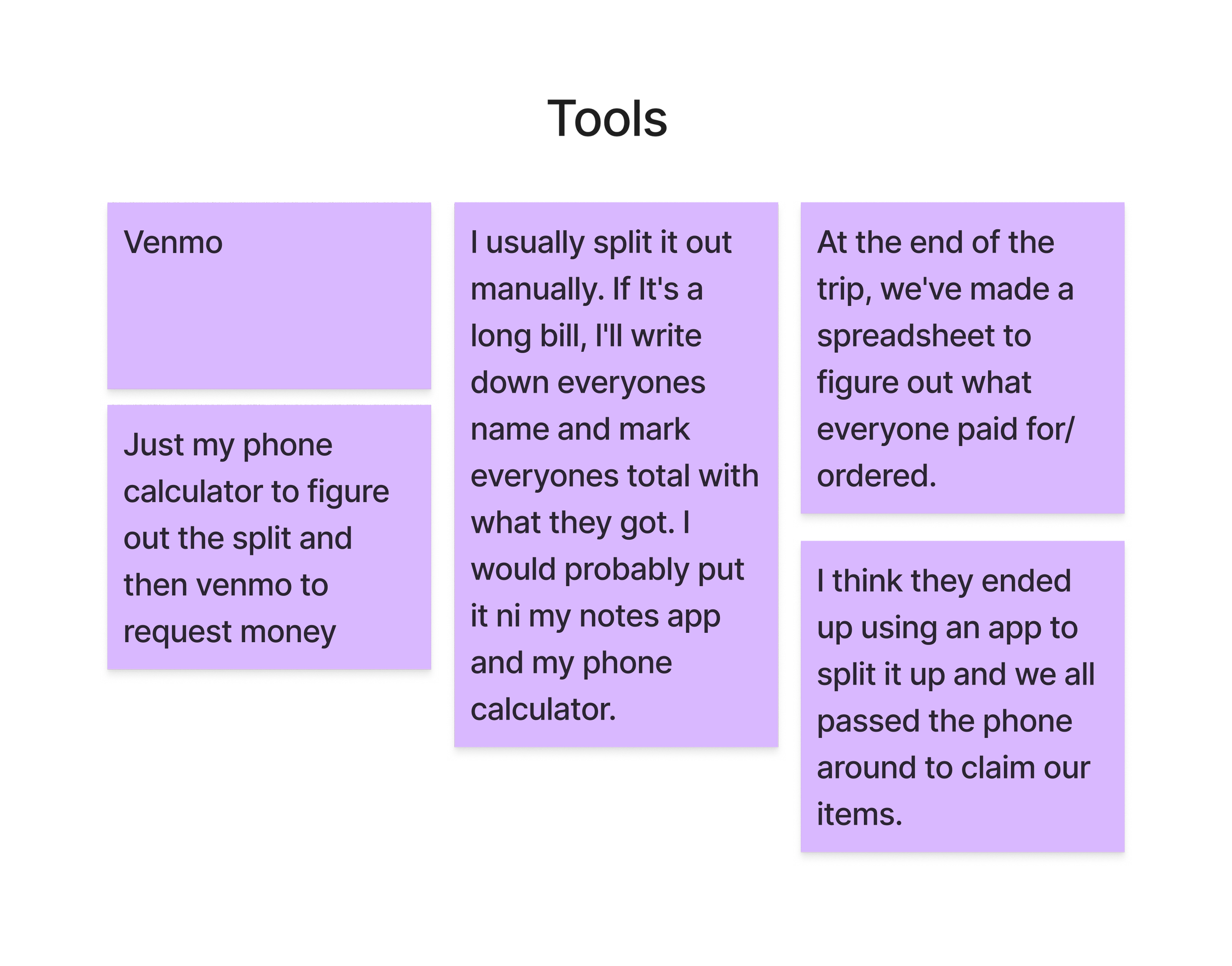
Workarounds Exist - Many users still relied on a phone calculator for manual splitting.
Challenges Were Social, Not Technical - Most issues weren’t with the app itself but rather with accountability (e.g., getting friends to pay back)
Key Takeaways
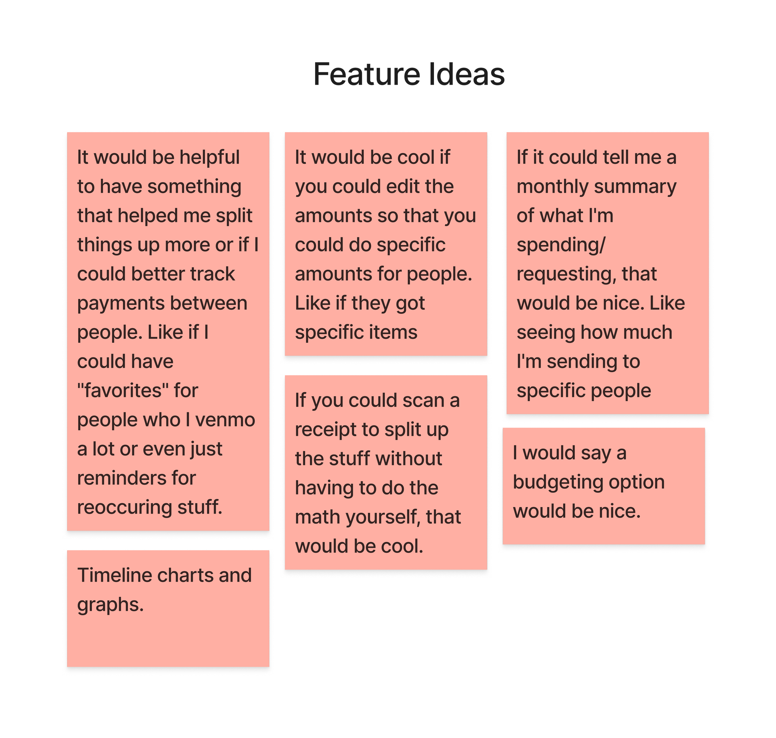
Receipt capture with auto-detection
Users struggle with manual calculations, leading to errors. This feature scans a receipt and itemizes it for you, eliminating extra steps. If an amount is wrong, you are able to edit it.
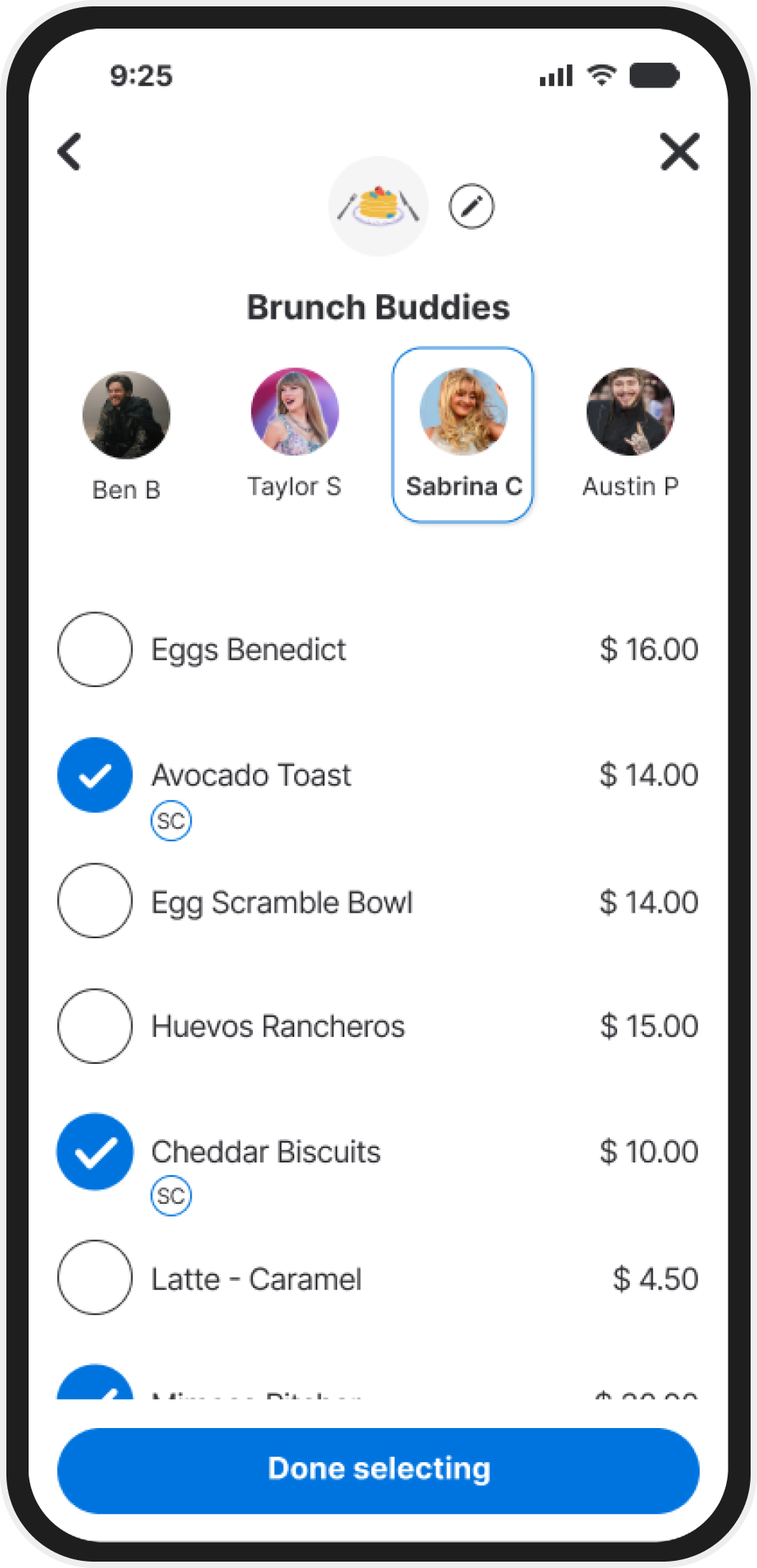
Streamline assignments for faster splitting
Many people found it tedious to manually calculate and assign amounts to friends. A tap-to-assign interface speeds up the process and keeps track of everything you've attached their name to.
Integration into Venmo
Interviews showed users were relying on avoided third-party apps to assist with calculations and then moving into Venmo to request the payment. Keeping the feature within Venmo streamlines the process, eliminating the need to switch apps.
Users already rely on Venmo for expense splitting, making this a natural feature extension.
Competitor apps require separate platforms, creating friction.
Automating receipt breakdown could reduce errors and speed up payments.
Opportunities
Ensuring a seamless experience that integrates with Venmo’s current interface.
Balancing automation with user control to prevent incorrect splits.
Designing an intuitive workflow that works for both individual items and equal splits.
Challenges
Design Magic
From Sketches to Screens
To start brainstorming what the feature would look like, I started by mapping out user flows and sketching low-fi wireframes. Then, moving on to Mid-Fidelity wireframes in order to start testing early concepts. Validating ease of use before refining high-fidelity mockups.
Starting with User Flows
I started by mapping out Venmo’s existing “Request Payment” user flow to find a natural entry point for receipt capture without disrupting familiar behavior. My goal was to weave the new feature into the app’s flow so users could capture, split, and request in one seamless process.
Moving to Low Fi Sketches
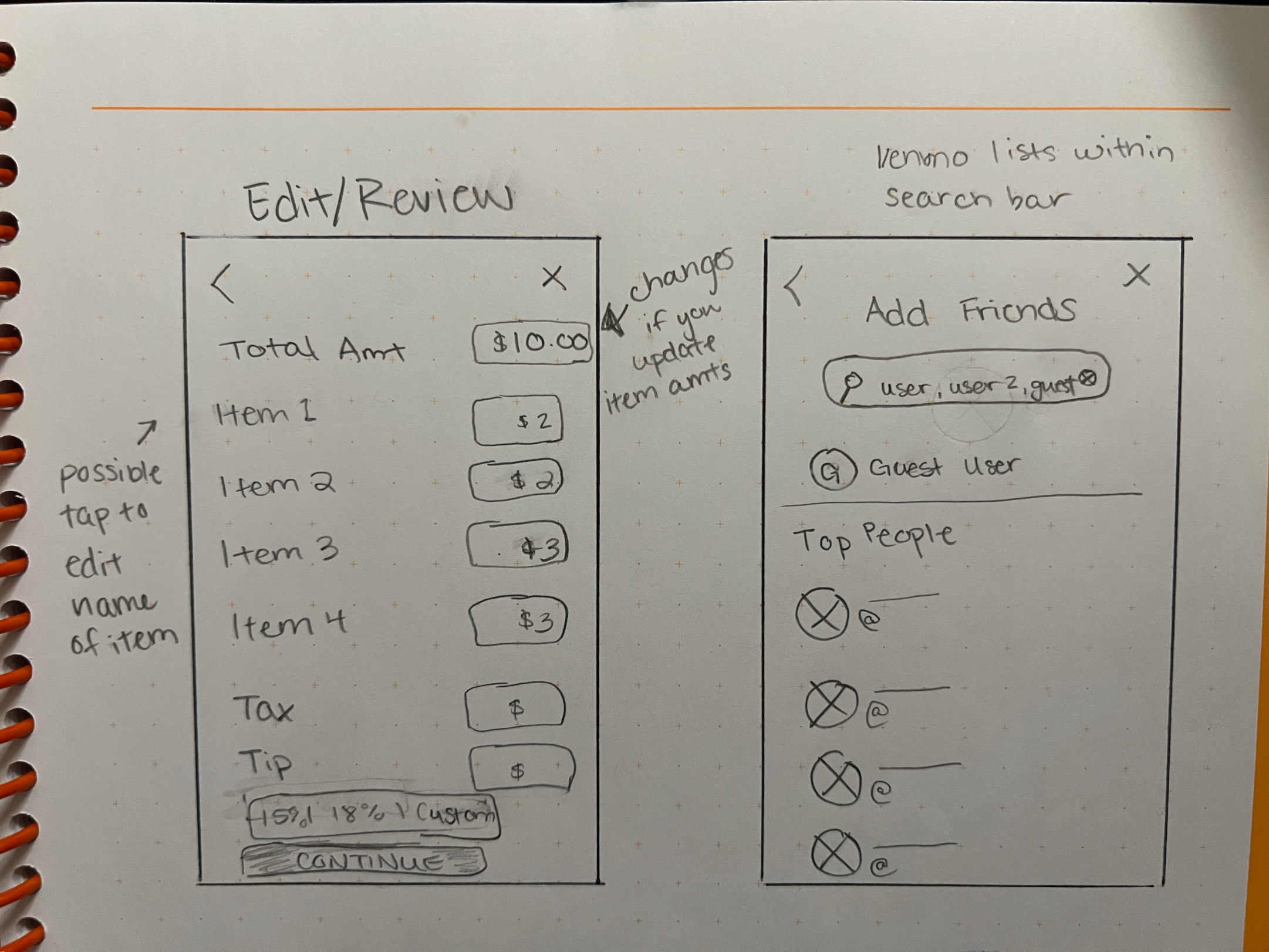
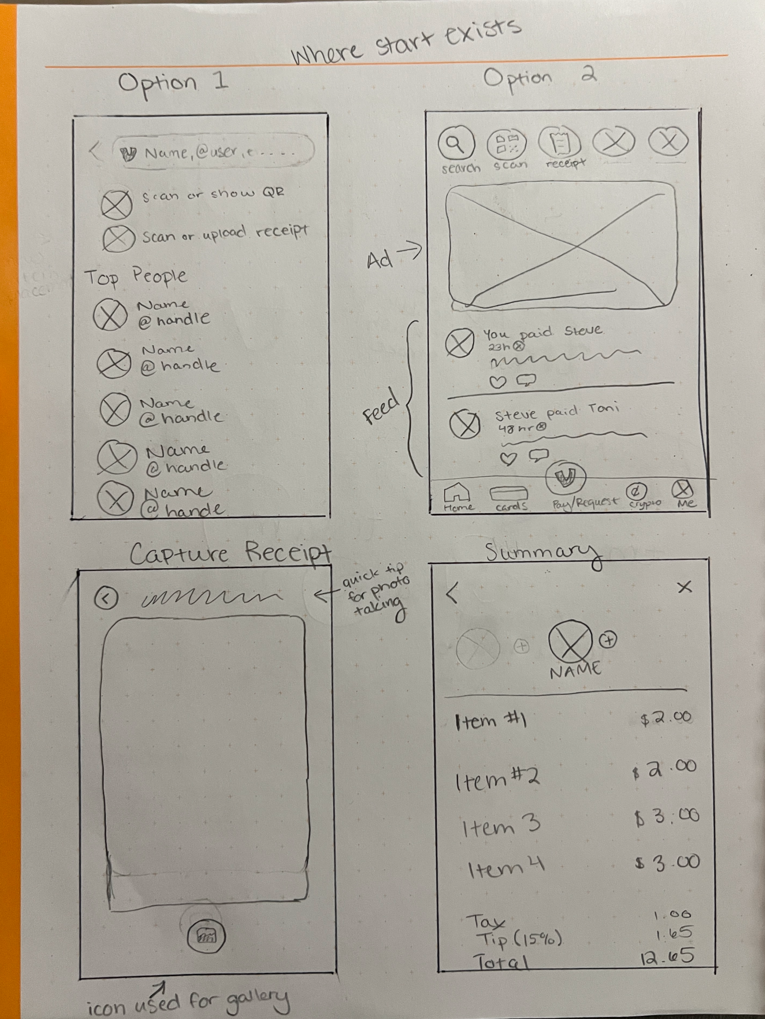
Focusing on functionality and structure, these early low fidelity sketches helped me experiment with the placement and flow without getting caught up in the aesthetic visuals. This made it easier to to identify what worked and what didn’t before I started moving forward.
Setting it up in Figma
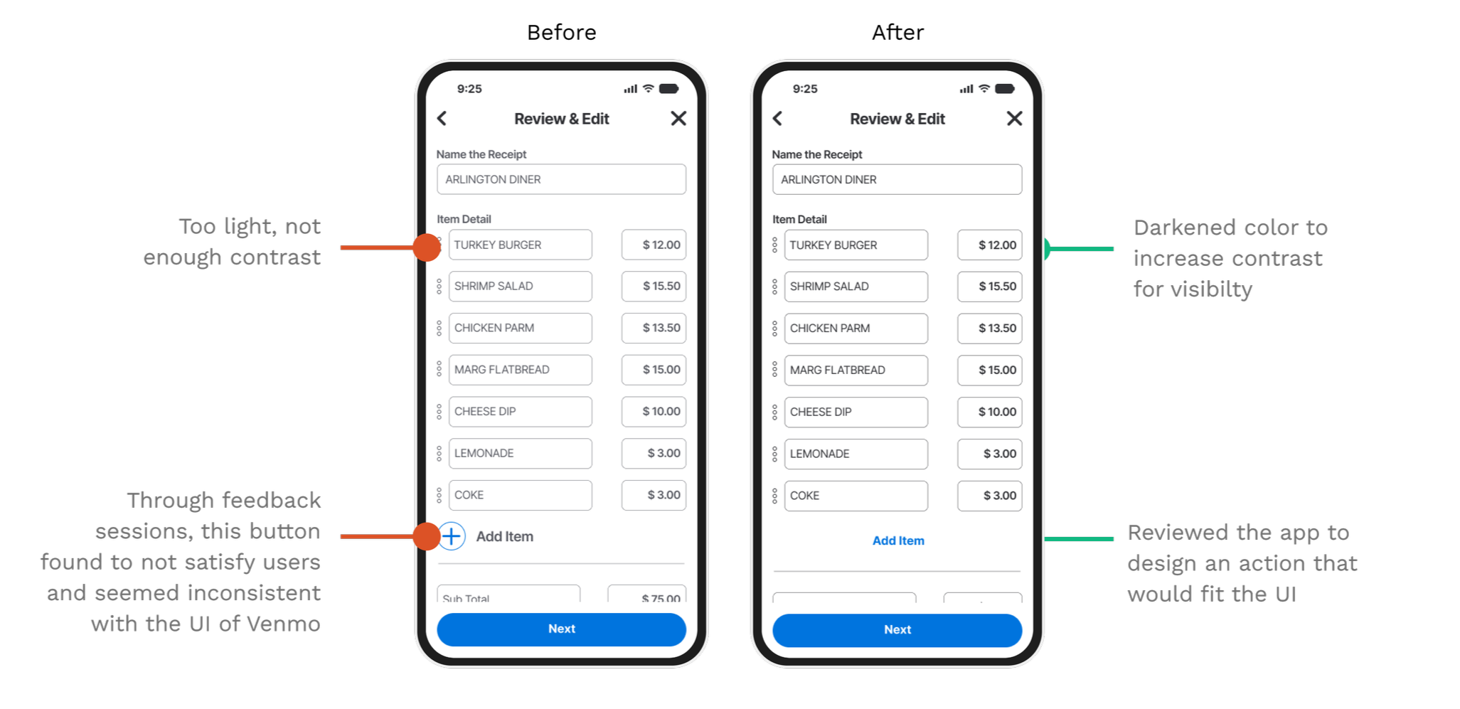
With the structure in place, I used mid-fidelity wireframes to test user interactions more realistically. Feedback from usability tests at this stage guided key adjustments, especially around selection clarity and tap targets, setting the stage for polished high-fidelity designs.
Early testing revealed small interaction snags that helped shape the next iteration
Some participants struggled to see if a person was selected. Adding user photos should help, but I’ll also adjust opacity and test a highlighted ring for better visibility
User testing showed mis-clicks just outside selection circles. To fix this, I’ll expand the clickable area.
Participants suggested colored circles for selections—this feature will be included in the high-fidelity mockups.
User Testing
What Worked & What Didn’t
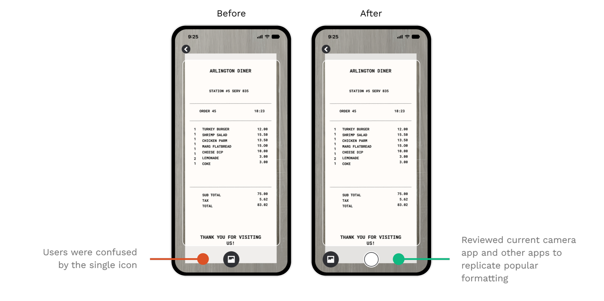
Usability tests showed what clicked and what needed tweaking. Take a look at some before and after frames that show improvements through user testing.
Final Designs
After testing and iteration, these are the features that solved real user pain points and made the final design stronger.
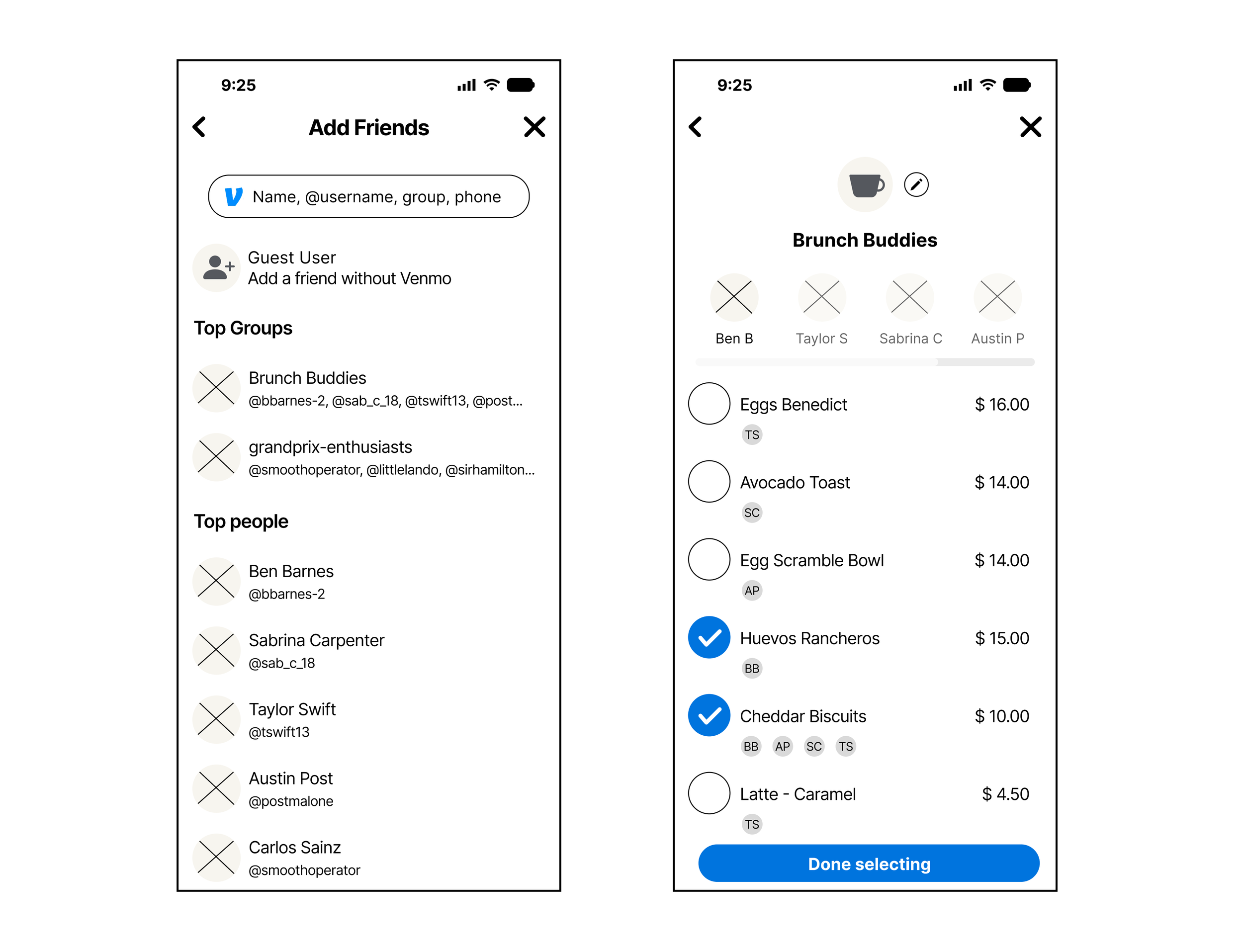
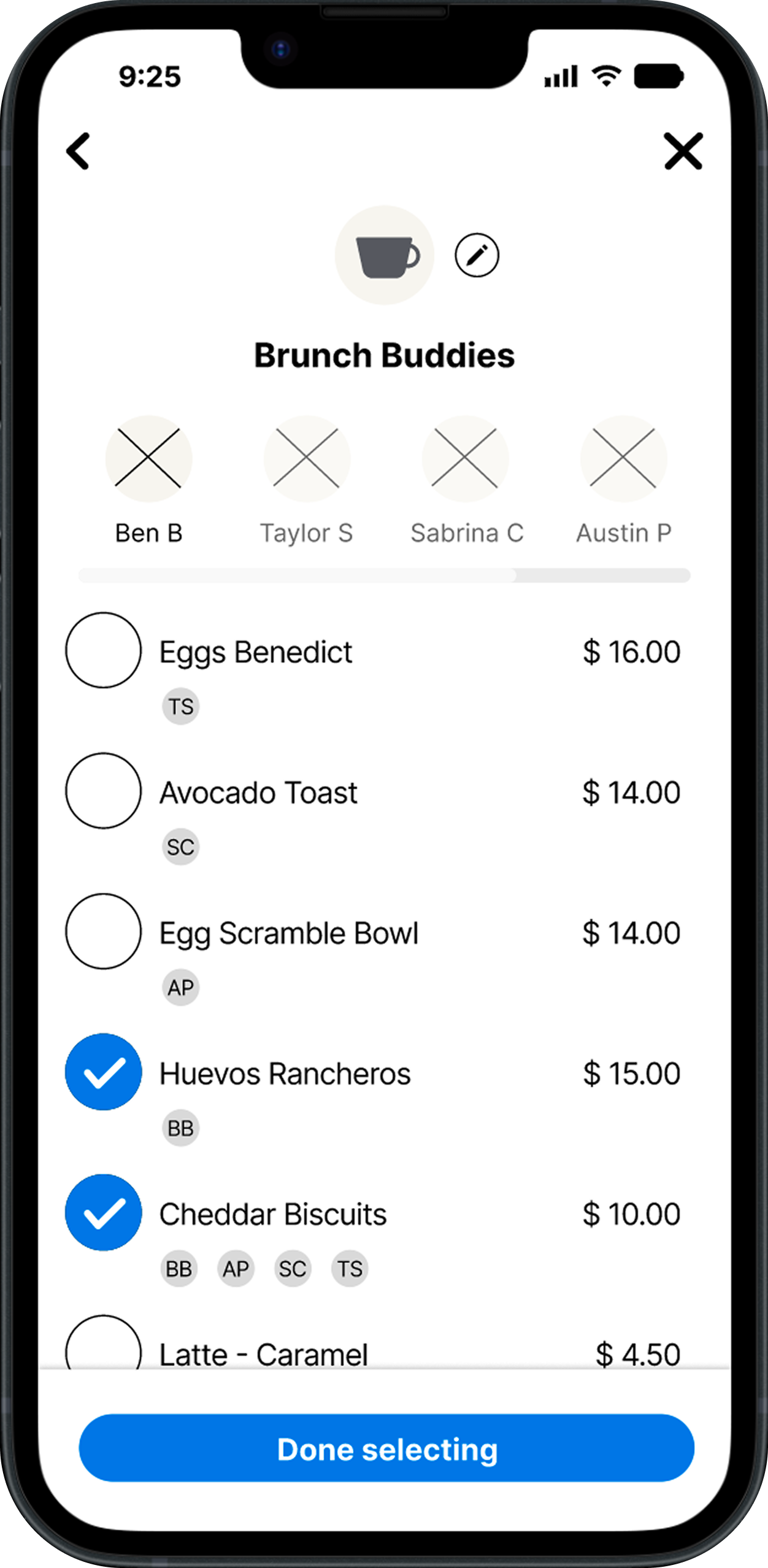
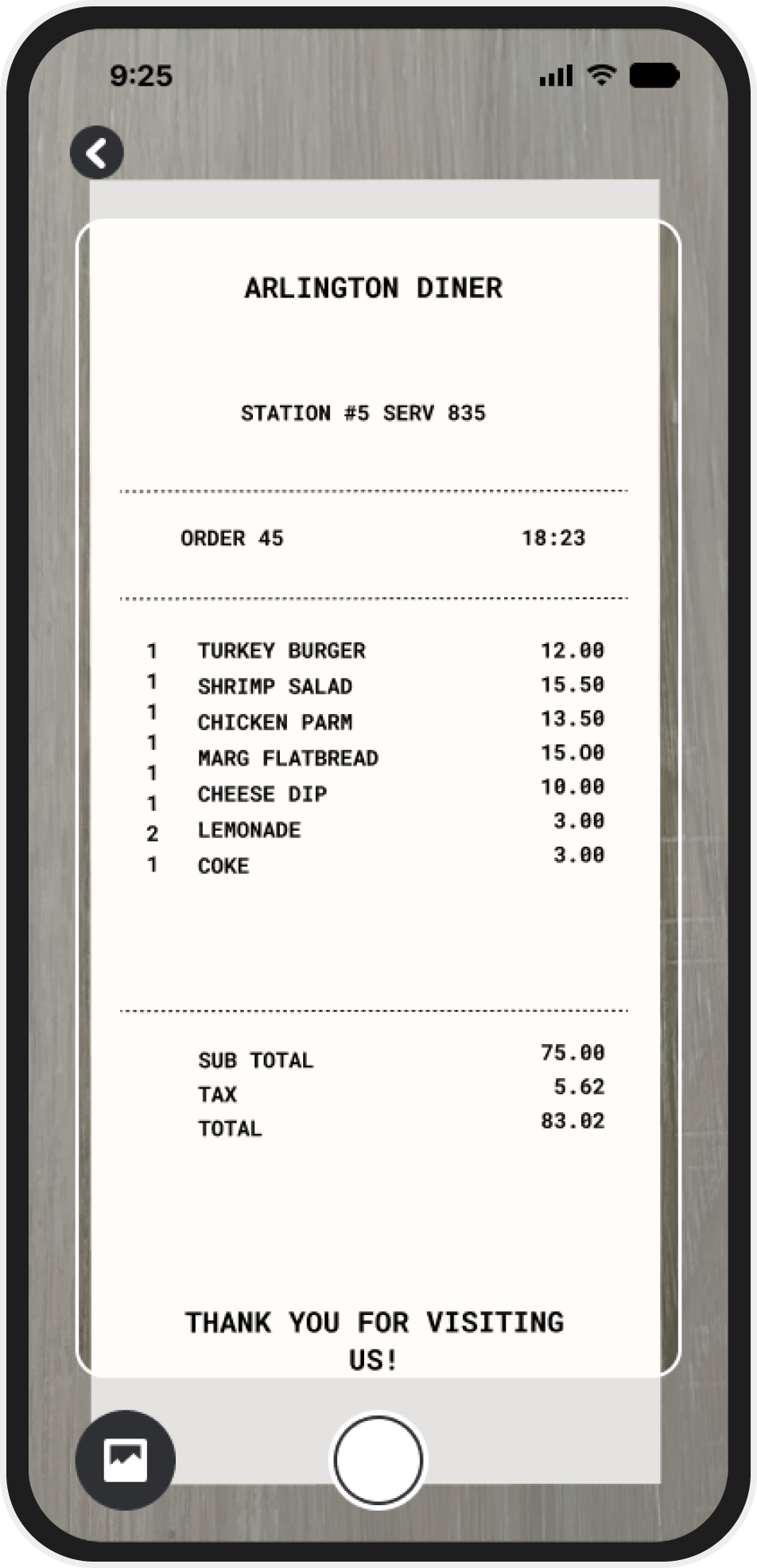
Auto-scan & detect items

Users can snap a pic of their receipt, and Venmo will automatically detect and separate the items - saving time and reducing the need for mental math or third-party tools.
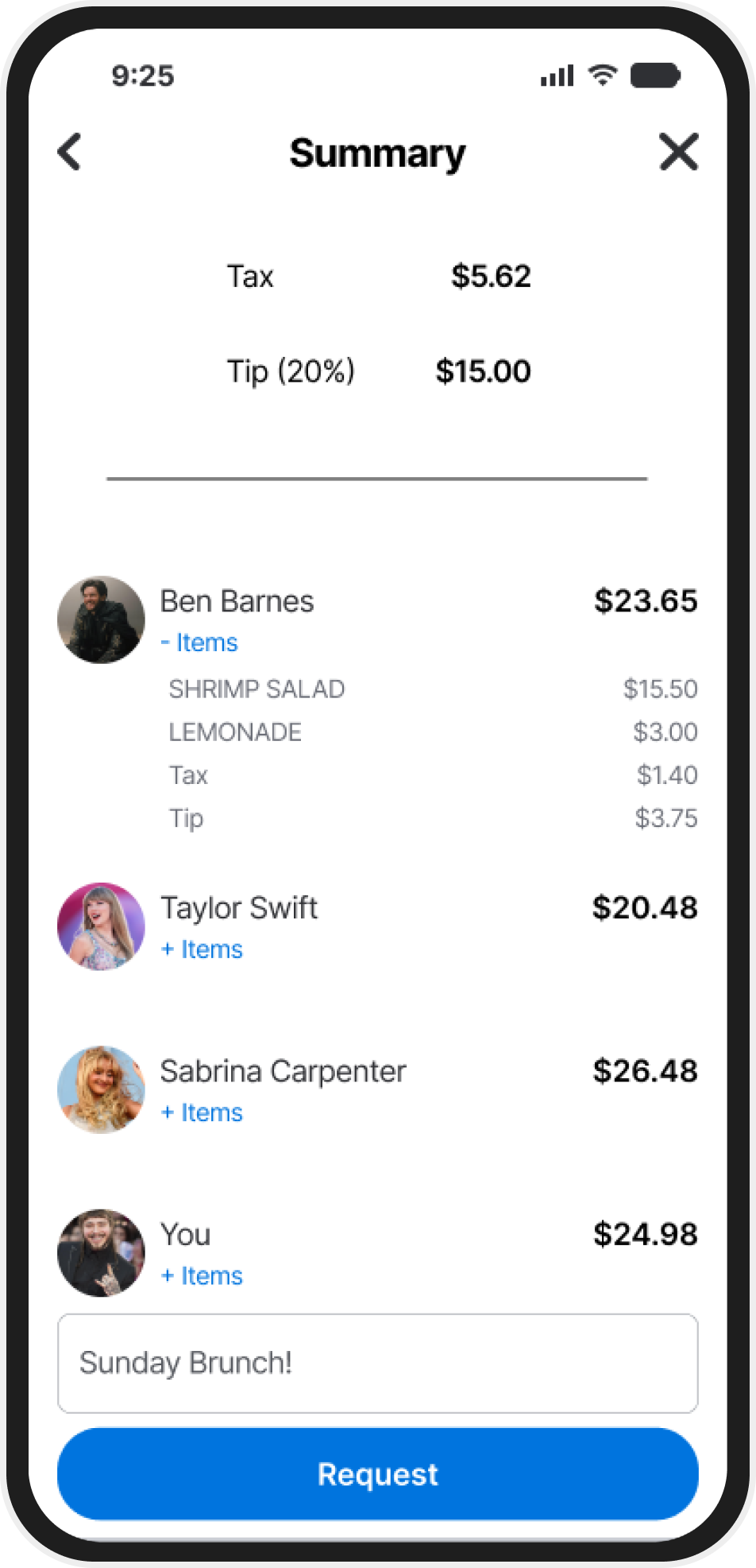
Manual Override
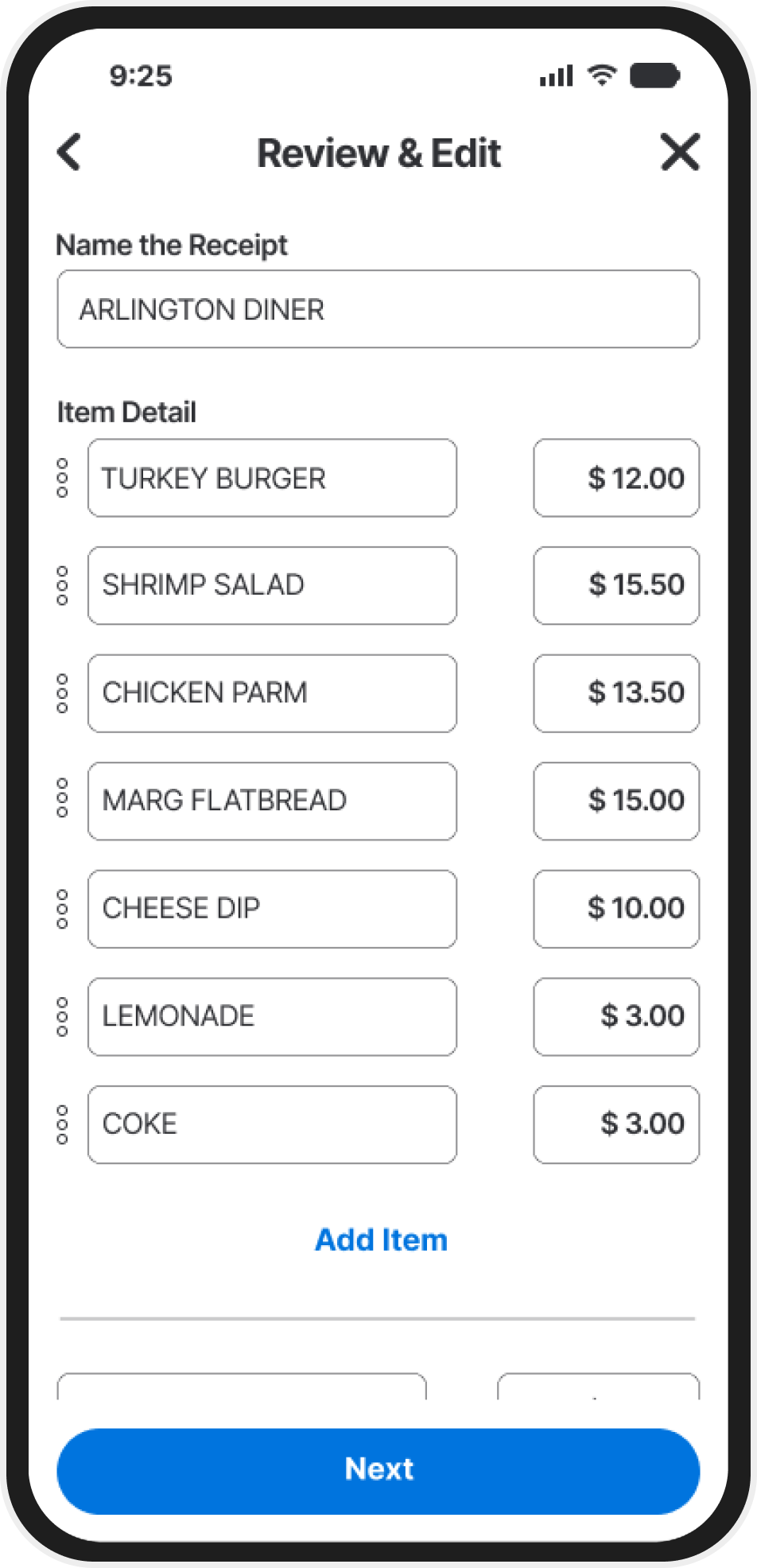
Sometimes, auto-scan isn't 100% right.This feature gives users the power to manually adjust line items, assign them to friends, or correct any mistakes which ensures accuracy and flexibility.
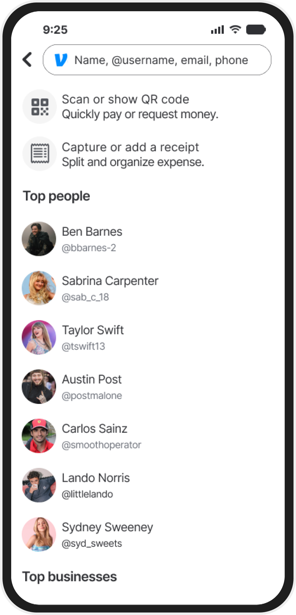
Seamless Venmo integration

Built to feel like it was always part of Venmo. The receipt capture flow blends right into the existing payment request process, minimizing disruption and making adoption easy.
Success Metrics
This feature would increase user engagement by increasing the amount of time spent within the app. Faster & more accurate payments will reduce manual calculations and increase efficiency due to not switching between apps. Offer a competitive advantage against other apps that have you pay for this type of feature or that lack the "all in one" experience.
Final Designs

My Conclusion
This project significantly contributed to my growth as a UX designer by challenging me to work within the strict constraints of an existing platform. While it limited some creative freedom, it pushed me to focus on problem-solving and functionality. By maintaining Venmo’s UI in order to introduce a new feature, I strengthened my ability to design cohesively within an existing framework, rather than creating something entirely from scratch.
Throughout the process, user testing and feedback were integral to refining the design. By staying engaged with participants and revisiting the original app for reference, I ensured that the new feature aligned with both user expectations and Venmo's interface. Although some trade-offs had to be made, such as modifying certain elements to fit user preferences, the project taught me the importance of balancing new ideas with user familiarity and app consistency.